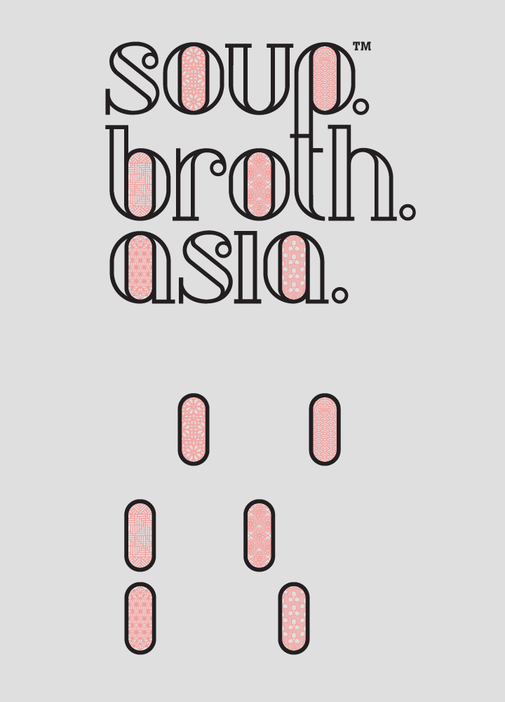
SOUP BROTH ASIATo secure their foothold in the market, The Soup Spoon introduced Soup Broth Asia as a vessel to promote Asian soups. Tasked with producing its brand identity, we took advantage of the rich uniqueness of Asian patterns and with each collateral, created a design specific to its purpose and application. Inspired by the origins of the soups’ recipes, the six representative patterns lacing the “O” counters in the logotype are rooted in traditional Chinese, Japanese, Korean, Burmese, Thai and Peranakan motifs. |
 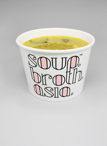 A take-out soup bowl. A take-out soup bowl.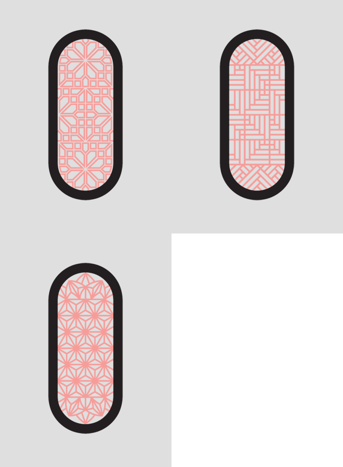 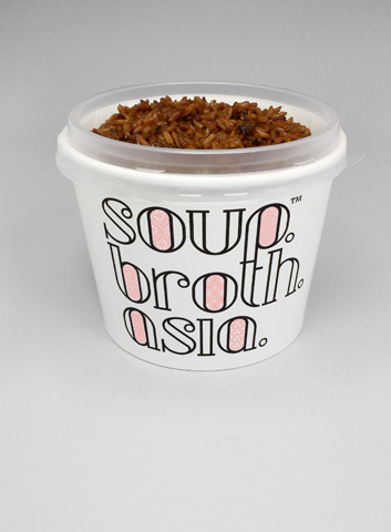 An alternative serving – one with rice. An alternative serving – one with rice. 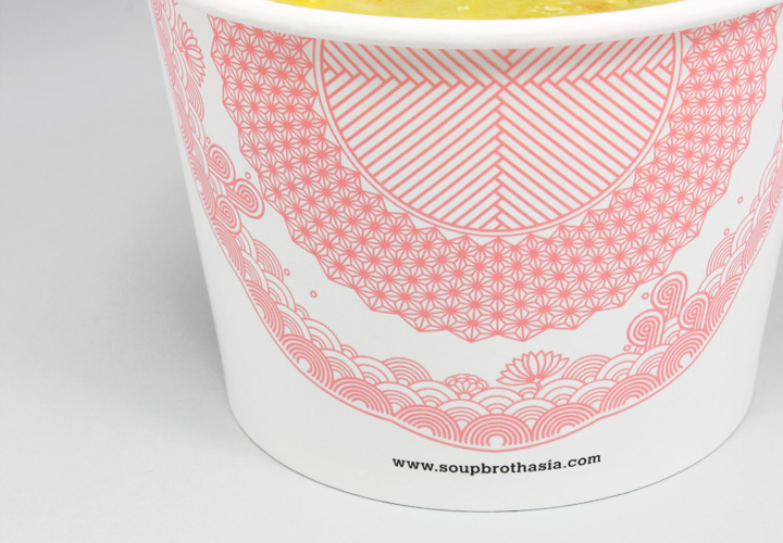 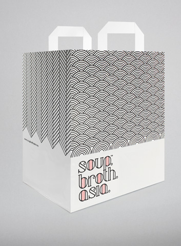 Take out bags with a different pattern on each of its four sides. Take out bags with a different pattern on each of its four sides.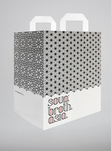 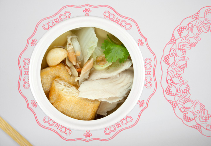 Burmese and Korean embroidered plate motifs. Burmese and Korean embroidered plate motifs.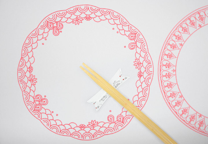 Japanese and Thai. Japanese and Thai.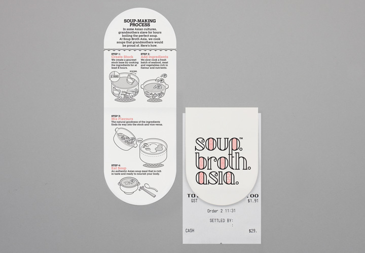 A soup-making process card doubles as a receipt holder. A soup-making process card doubles as a receipt holder.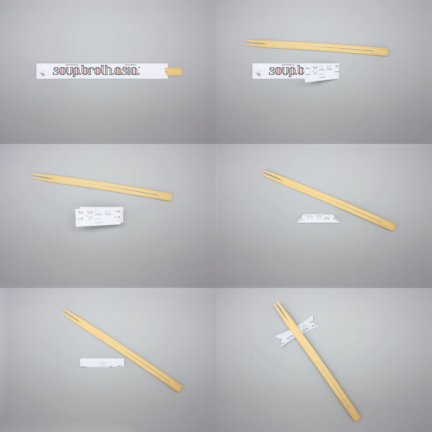 Wrapper with instructions on “how to make a chopstick prop” whilst waiting for your meal. Wrapper with instructions on “how to make a chopstick prop” whilst waiting for your meal.
|


